The case for a redesign
As businesses grow and evolve, products need to evolve as well with the diverse and growing requirements of the business and its customers/users. The first version of Rave was launched in 2017. It featured a dashboard for users to track their transactions as well as see their settlements. But as users evolve with new needs, there is a need to support their interests with a robust and evolving system.
- The first iteration of the Rave was built with no search functionality,
- The Rave dashboard didn’t have features to meet complex business requirements.
- It wasn’t mobile friendly.
With the product being more than 1 year old, it was due for an upgrade to address these issues and to build a system that would support customers and their business.
The first version of the Rave dashboard


The next step: Rave 2.0
One simply does not go into a redesign without being armed with data and feedback. The main mission for redesigning Rave was to enhance the user experience for the end user (Rave Merchants). Enhancing that experience meant making processes and features like Sign Up, Onboarding, and Tracking Transactions simple and easy.
The overall goal was to make improvements on the first version of Rave and add in new functionality which would enhance the experience for users and customers. This would involve evaluating the product as a team and get feedback from actual users.

Re-Design process
The design team took to the task of enhancing the Rave experience by having a one-week design sprint to address user pain points from Rave 1.0 and adding new functionality to enhance the Rave experience.
The process involved mapping out certain processes to find out ways to improve them, identifying personas for the Rave product and lots of use of Post-it Notes. During that week, the team also got input from some Rave users on the pain points they faced in using Rave 1.0.

Improving the on-boarding process
In trying to make it easier for users to start collecting payments, the Rave team worked on a better onboarding process for first-time users.

When new users sign up and log into Rave, they’re presented with a screen asking them how they would want to collect payments. Rave features various ways to collect payments from customers including Pay Buttons on their websites, integrating plugins into E-commerce platforms like Shopify and WordPress, use of Flutterwave APIs, and creating payment links (More on that feature in Part 2 of this series)
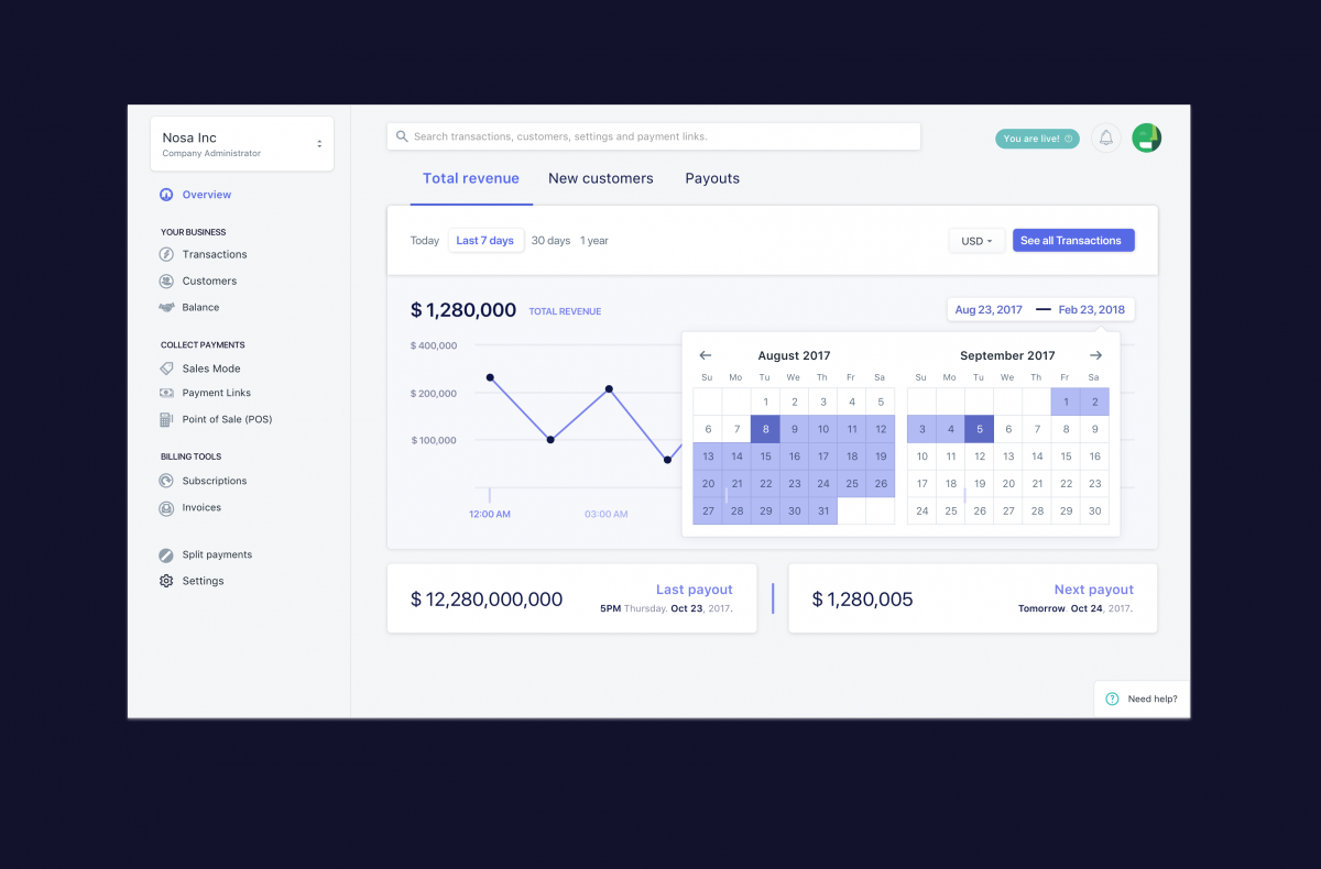
Streamlining navigation
One thing that the Rave team wanted to make easier was for customers to easily navigate around the new dashboard.
With the “Overview” tab in the side navigation bar, users can see their dashboard and an overview of all the transactions that have been made. Users can also see specific “Transactions”, view “Customers” who made payments, and their “Balance” which all fall under the “Your Business” section of the side navigation bar.
Under the “Collect Payments” section, users can access new features like “Payment Links”, “Sales Mode” and “Instagram”
(We’ll explore these features in Part 2 of this series)

More mobile friendly for those on the go
Nowadays, everyone is mobile and on the go. With this in mind, the Rave team had to make Rave 2.0 more mobile friendly for mobile users.
When users go to rave.flutterwave.com/stg on their mobile devices, they can log into their dashboard, track their transactions, see their balance and do a host of other things that they would do on their desktops on Rave.

Thanks for reading Part 1 of the Rave re-design process.
In Part 2, we’ll focus on new feature additions in Rave 2.0. We’ll explore the “Search” functionality, “Payment Links” and the new “Instagram” feature where users can collect payments on their Instagram using Rave.
Stay tuned!
]]>