In the final lap of 2021, we set out to simplify our international money transfer offering. Customers had the capability to send money across borders on Flutterwave. But we wanted a product that’s fully devoted to international money transfer, nothing more, nothing less. We set out to work, armed with nothing other than an unrealistic deadline for ourselves, we created the very first version of Send App, called $end, and went to market with Wizkid. People loved it, but we knew something was lacking; as fast and simple as it was, it lacked a soul and as important as what it does is, it was pretty dumb at communicating it.
From $end to Send App
Ted, who led Design on V1 and V2 put it clearly, “$end was like a toddler, but now it has grown older to become Send App. It now has its own personality that reflects its background and north pole–making it easier for Africans at home and abroad to connect with and support one another through sending and receiving money across the world.”
Building Send App came with its challenges and opportunities. But massive thanks to folks that worked on the product across all functions from inception to launch. Through the process, I was in close contact with Temi from Product, Ted, Oshomah, Kolapo, Mide, Eniola from Design, Dikachim, Wendy, Chinaemerem, Owuraku and Nonso from Marketing, Abel, Funmi and Uzo from Engineering and I learned a lot from them on how these things work, some of which I will be sharing with you all. (Yes, I learned a lot from them!)
In redesigning Send App, we went for motion and beauty. I have seen a lot of well meaning people ask why we would go the maximalist approach, for a money transfer app? Well, look at the cultures in Africa. Are they minimalist or maximalist? Have you seen a Nigerian traditional wedding? How about a Zulu or Xhosa wedding? Have you seen a Ghanaian Wedding? The colors, the poise, the pageantry? So, it made sense to me when the Design Team came with this direction; Let’s build something that truly represents us, our cultures and our enthusiasm.
Building Send App: Design vs Front-End
As a Software Engineer turned a Product Manager and then Founder, I understand too well the tension between an ambitious Design Team and an Engineering Team. So when our Design Team came up with Send App’s second mockup, which happens to be the one live now, after more iteration, we knew the Front-End Team had met their match. But did they?
Oshomah and Abel highlighted constant communication and collaboration as ways they resolved tensions and challenges between Design and Front-end development.
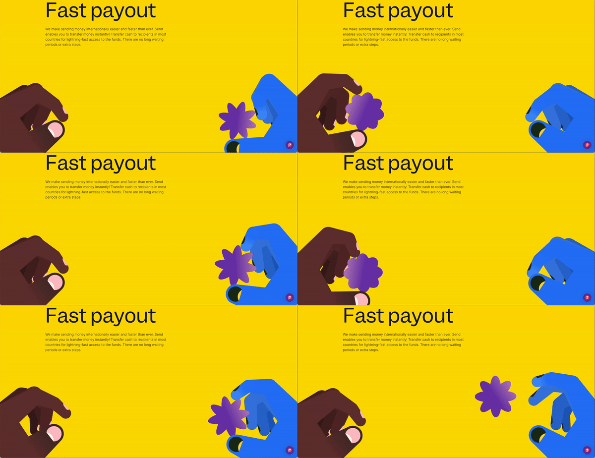
“First, I would like to say we have very competent people in the Engineering Team. I remember an experience where we were talking about how we could execute “the hand” widgets on the Website and Mobile App. A lot of us said it would be difficult. But when we discussed it with the Engineering Team, it was just straight up. Yes. It can be done, and it is just like that,” Oshomah said.
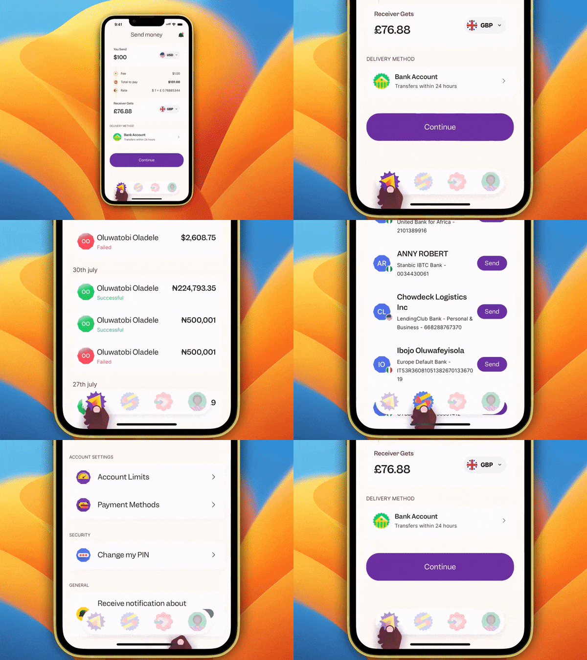
Abel added “Constant communication between teams to ensure that as simple as an interaction might be, it’s smooth and not jagged. And fortunately for us, we have KP on our team. He fully understands how to translate designs into front-end experiences.“
More than just pixels
But Send App is a little more than just beauty and a pleasant experience. There’s the new countries; US and Canada where you can now send from. And then there’s Egypt and Senegal where you can now receive from, among others. There’s also the revamped status bar and smoother onboarding. Temi thinks all of these are just a tip of the iceberg on what to expect.
But then here’s a shout out to Temi, Send App’s Lead product manager for pulling this off. He had to work with almost all of Flutterwave to bring the Send App together and how did he do that? Relationship building, he said.

“Substantial relationships, beyond work, with the various teams and the people working in those teams came in handy for this project.” A lesson I keep sharing is how much building relationships matter. And it’s not just building relationships upwards, it’s about horizontal and downwards too. That intern could help you meet a crucial deadline by prioritizing your request to the VP. Temi gets it and it comes in handy.
Naming: $end vs Send App
Before it was Send App, it was $end with a dollar sign. But after we named the App, we ran into some problems. The SEO was not as strong as we’d want it to be across all platforms because, how do you monitor a product called $end on social media? Also, a lot more people were calling us Send App. So, it was easier for us to rebrand to Send App. And if you search Send App on Play Store or App Store, we do rank in the top 2 for that name. Little wins!
Dikachim, our Head of Product Marketing was the brain behind this, “When you send money for your younger brother’s school fees, it goes beyond the transaction; it signifies a deeper bond. Recognizing this, we realized the need to inject more personality into our approach and convey that every action on Send App is an expression of love. We needed the app to stand out everywhere. This shift in perspective has made it easier for people to find us on social media by searching for Send App when they want to discuss or engage with our service.”
With Love, for Love and for You!
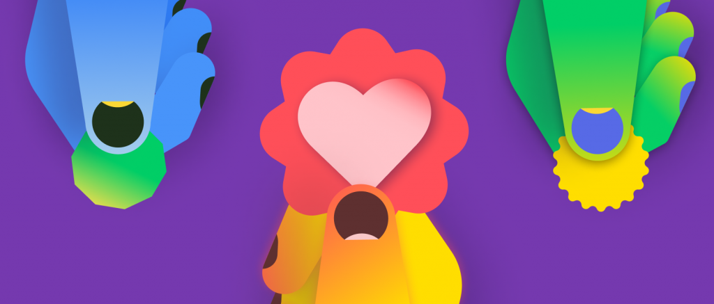
And how do you take a solution built with love and for love, to the market? Dikachim, Wendy, Owuraku, Nonso and Chinaemerem worked round the clock, with LOVE, I guess, to bring it to all of you in the best possible way. It was an interesting announcement which had product, expansions and design implications.
The rebrand was heavily amplified on Social Media while the expansion to Canada, US, Egypt and Senegal were amplified in the press. The product features were pushed through existing $end channels like Emails and Push notifications.
One thing I noticed was that they segmented the various aspects of the announcement according to the audience. But in all of this layered messaging, there was a consistency like no other across all touchpoints, because no matter where you see Send App, you’d know it’s the solution for love. And you’d be pushed to put your money where your heart is.
For Chinaemerem, the direction was clear from the onset
“Our approach also ensures people engage with our marketing materials and perceive a consistent narrative across various touch points. This reinforces the need for synergy between Branding, Design, and Storytelling, which was crucial for our success. Without it, our go-to-market message wouldn’t hit.”
